Five Years of Design
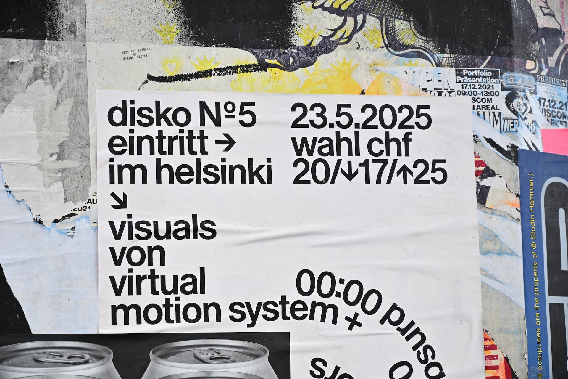
In September, I had the privilege of being able to attend NixCon 2025 in Rapperswil-Jona, Switzerland. Aside from listening to a lot of fun and/or interesting talks about Nix (“You can’t spell ‘devshell’ without ‘hell’” was one of my favorites) and meeting some of my friends in real life for the first time, I also had the wonderful opportunity to observe Swiss graphic, and especially typographic, design in action. This experience started with Zürich Tourism’s website; it left a lasting impression on my mind, since it was one of first usages of Helvetica-adjacent neo-grotesque sans-serif fonts that looked good in my opinion. The use of various colors and font weights made the font (a custom one; “Zurich Haas”) an essential part of the website’s character.
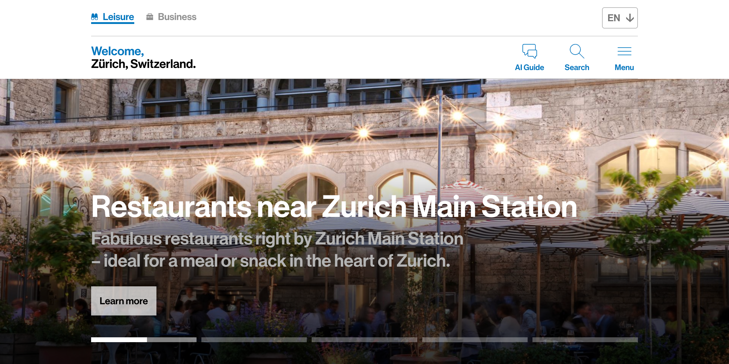
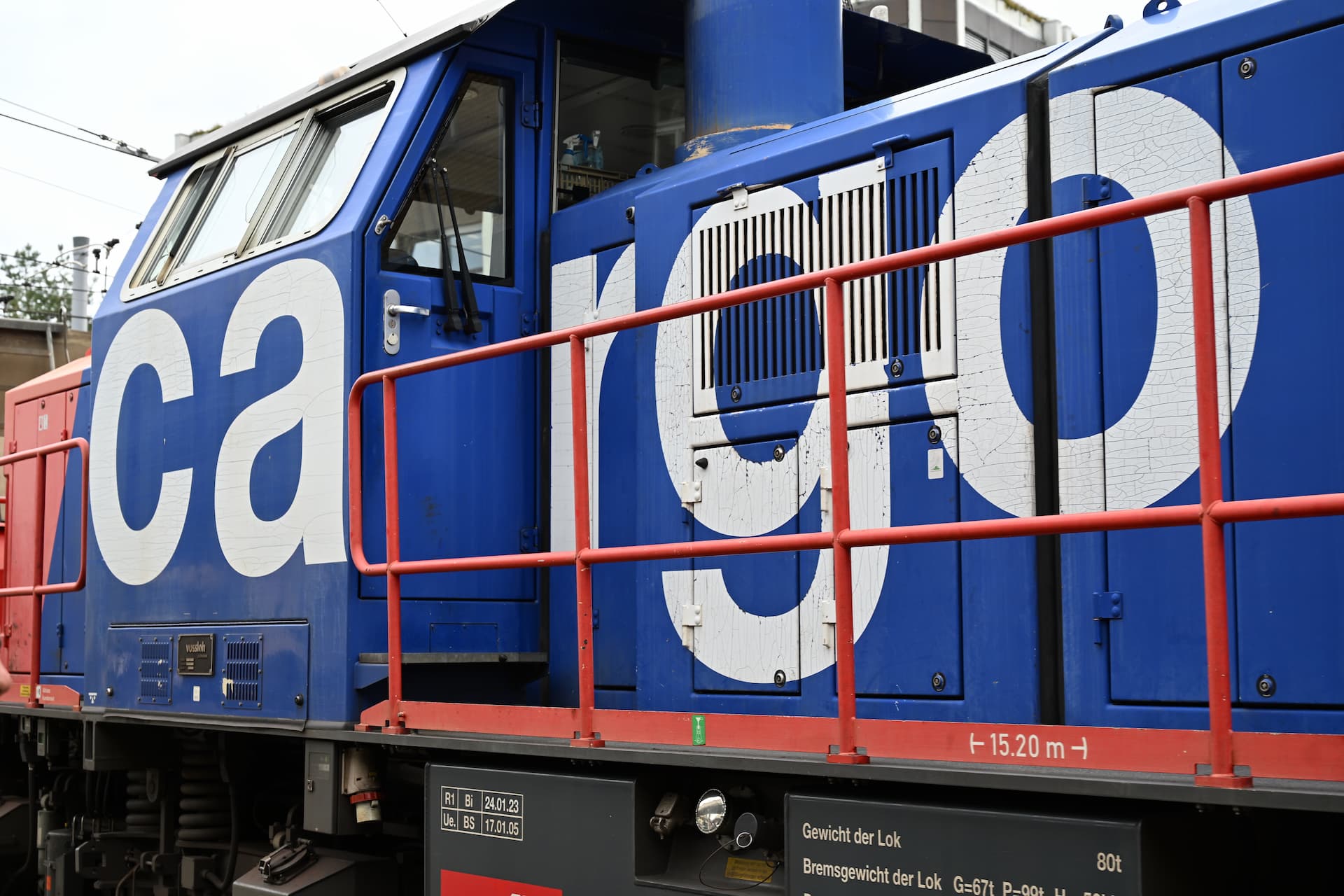
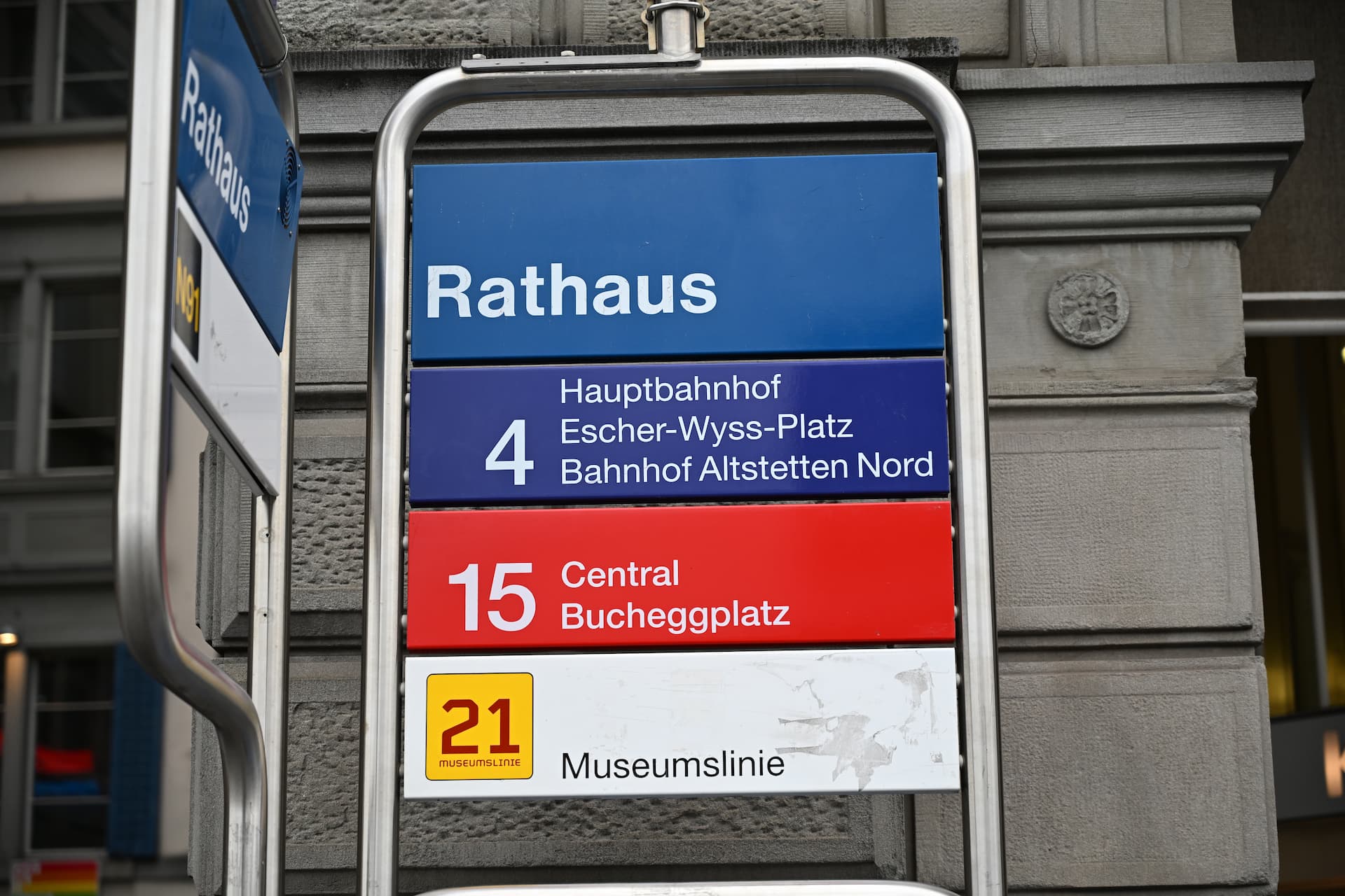
In Switzerland, the same style of font appeared everywhere: wordmarks on trains, signage in train and tram stations, posters, and even receipts. What struck me most was the prominent, almost blatant placement of text, often in exceptionally large sizes, as the central element in a design. This stylistic choice conveys information very clearly to viewers without distracting elements, and fully demonstrates the inherent elegant design of the font as well — a utilitarian design, but beautiful in its utilitarianism.
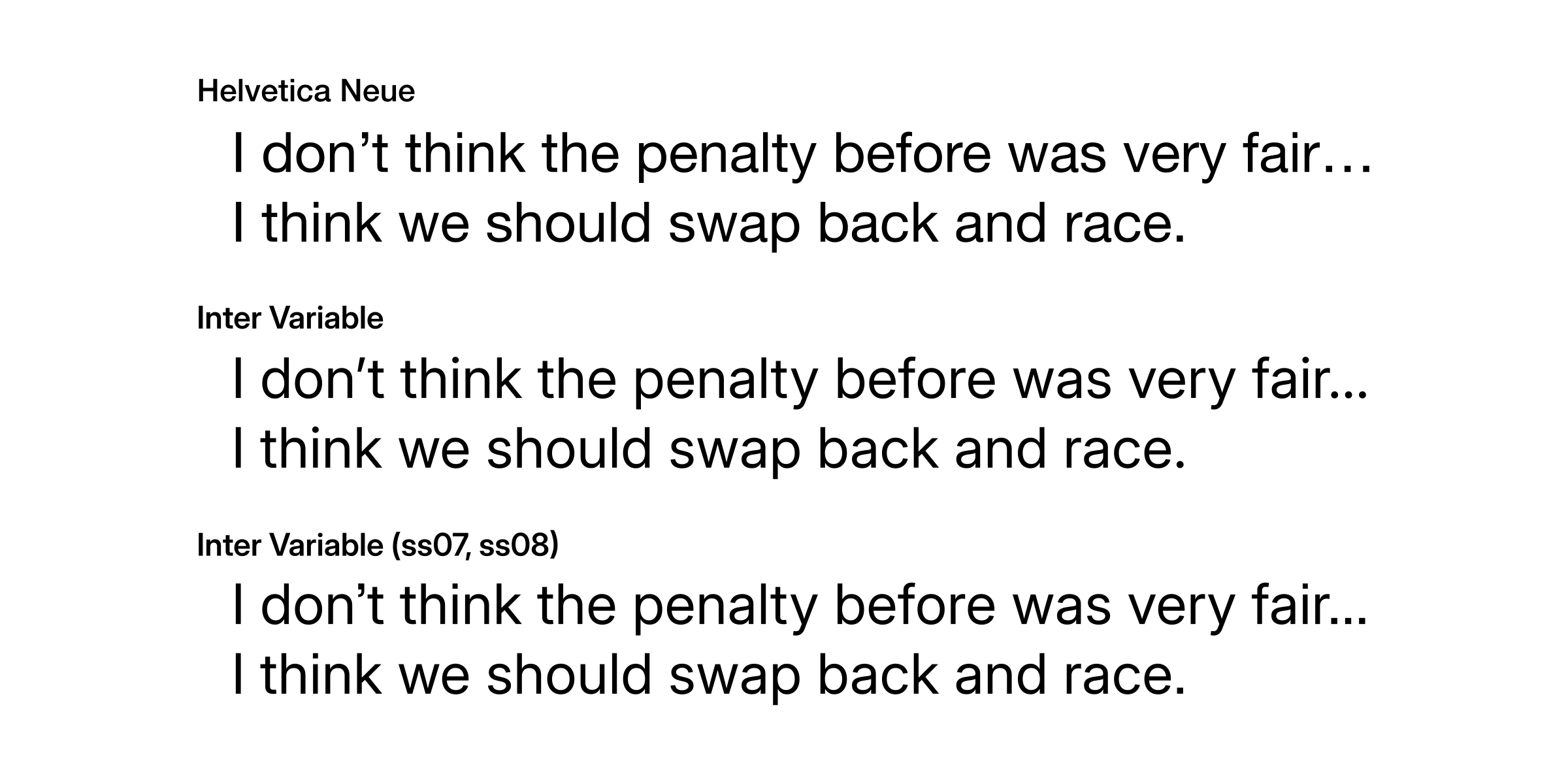
Inspired by all the instances of Swiss style design that I had seen, I set about redesigning my website in this style. The first step was finding a suitable neo-grotesque sans-serif font face. Helvetica was, no doubt, the best option. Monotype designed an update of Helvetica in 2019 called Helvetica Now, and it looked to be a pretty great choice; it was also $548.99, so I looked to other potential alternatives. In my search, I discovered several other amazing fonts: Suisse, Neue Montreal, and Söhne. They all looked like what I was looking for, but unfortunately I wasn’t prepared to allocate a particularly significant amount of capital to a font family for my personal website. So what you’re looking at now is what is possibly the most overused free and open source font family in the history of web design: Inter. The majority of glyphs in Inter actually look somewhat similar to Helvetica, and while experimenting with font features, I discovered the ss07 (square punctuation) and ss08 (square quotes) stylistic sets which, when enabled, made Inter look a lot more like Helvetica and less like Inter.
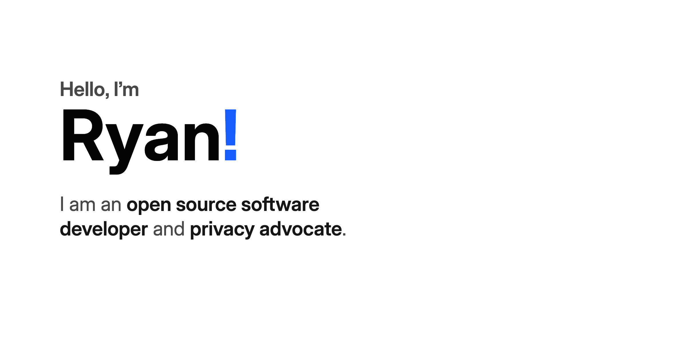
After deciding upon the font, the next typographic features to make modifications to were the font sizes and weights. I decided to try out increasing font sizes to dramatically large sizes, especially to emphasize one important feature on a page; I also increased the general font size scale across the website. The largest font size in use went up to 8rem (a maximum of 128px depending on your viewport size), making the visual center of a page more apparent and conveying important information in a more upfront manner upon initial viewing. The increase in differences between adjacent levels of font sizes in the visual hierarchy also meant that the overall layout and flow of pages became much clearer than before.
In addition to typography, I also experimented with introducing more bits and pieces of color onto the website. One of the ways in which I did this was making the punctuation mark (e.g. periods, exclamation marks) at the end of prominently displayed titles or sentences on pages use the website’s global accent color. This adds some liveliness to the overall design by introducing some variation, as well as drawing more attention to the parts of a page that require a viewer’s initial attention. Borrowing a neat trick from Miniflux, I also made part of my name (i.e. the website’s title) have color and switch to the other part having color on hover.
How long will this iteration of my website stay in use? I’m not sure myself. It might be here for a month, a quarter, or even a year. Nonetheless, I love this design, and not just because it is a realization of an aesthetic ideal that I’ve admired for a long time; it’s also because it is the cumulative result of the long way I’ve come in software, and especially web, development.
I still remember my very first attempt at a personal website a few years ago, when I first started: a crude clone of Evan You’s website at the time, uploaded as a ZIP archive and hosted on a random free website host.
As the content of this website diversified, with blog posts and other content pages, its design changed rapidly as well. The next major iteration that I can distinctly recall is one built with Next.js, with a design referencing that of Brian Lovin’s old website.
These early days of this website were often imitations of other peoples’ websites whose design I really enjoyed when I happened to come across them on the Internet. I didn’t know much about how to design interfaces by myself yet, and even if I had a rough idea of what something should look like, I didn’t have the ability to transform that idea into a reality that matched my vision.
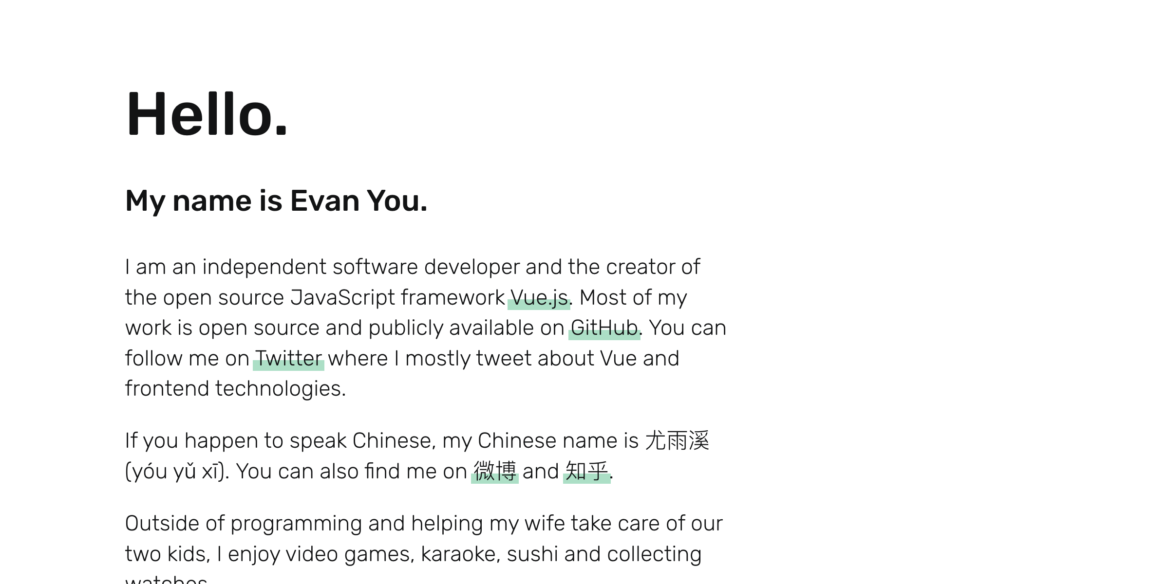
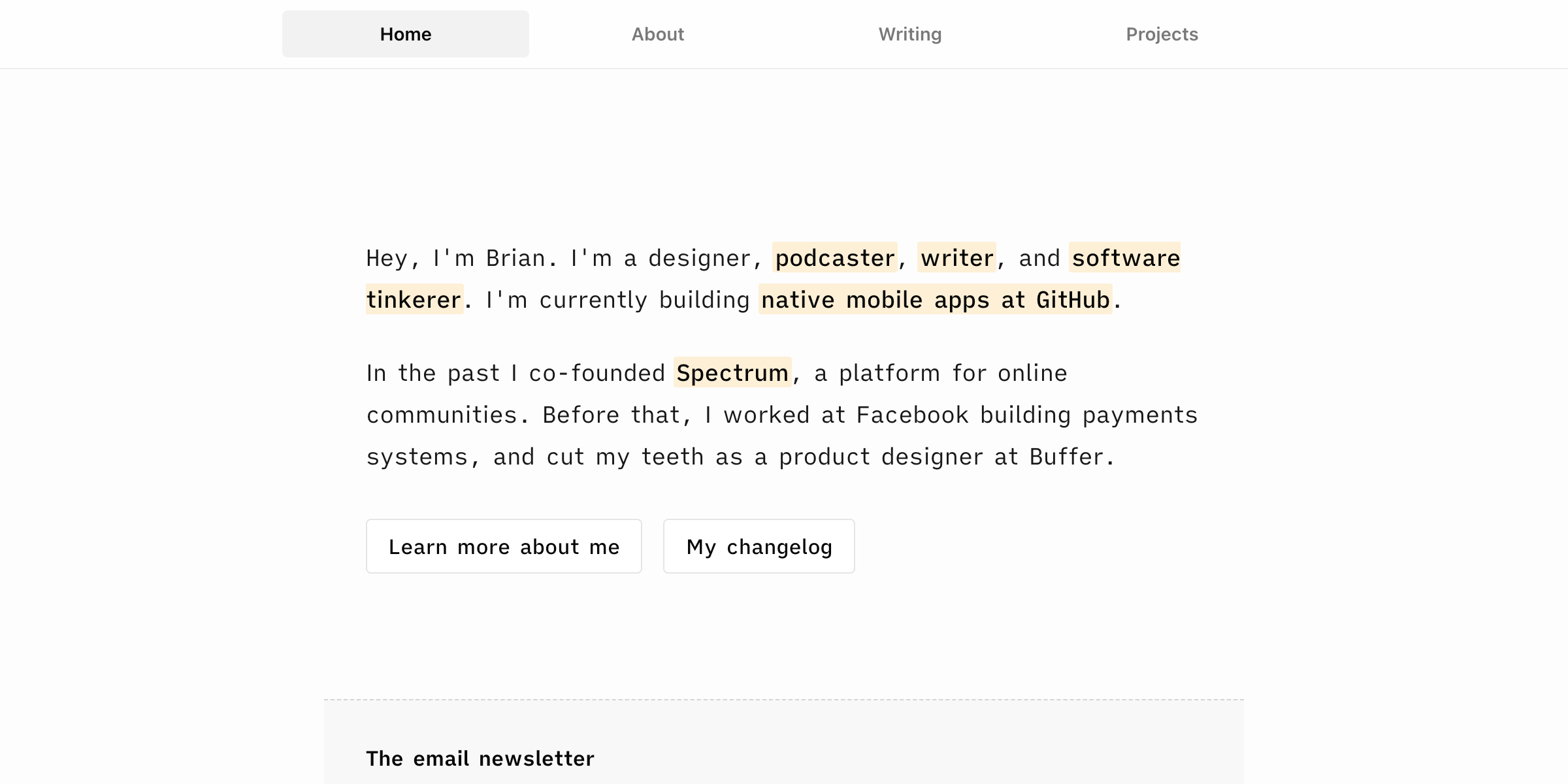
The modern story of this website, and the codebase currently in use today, starts in 2021. Having come across Tom MacWright’s website, I was fascinated with the minimal and clean design language that it used: a primarily black and white color palette, a mostly uniform font size throughout the website, and singular Unicode arrow symbols indicating navigation state.
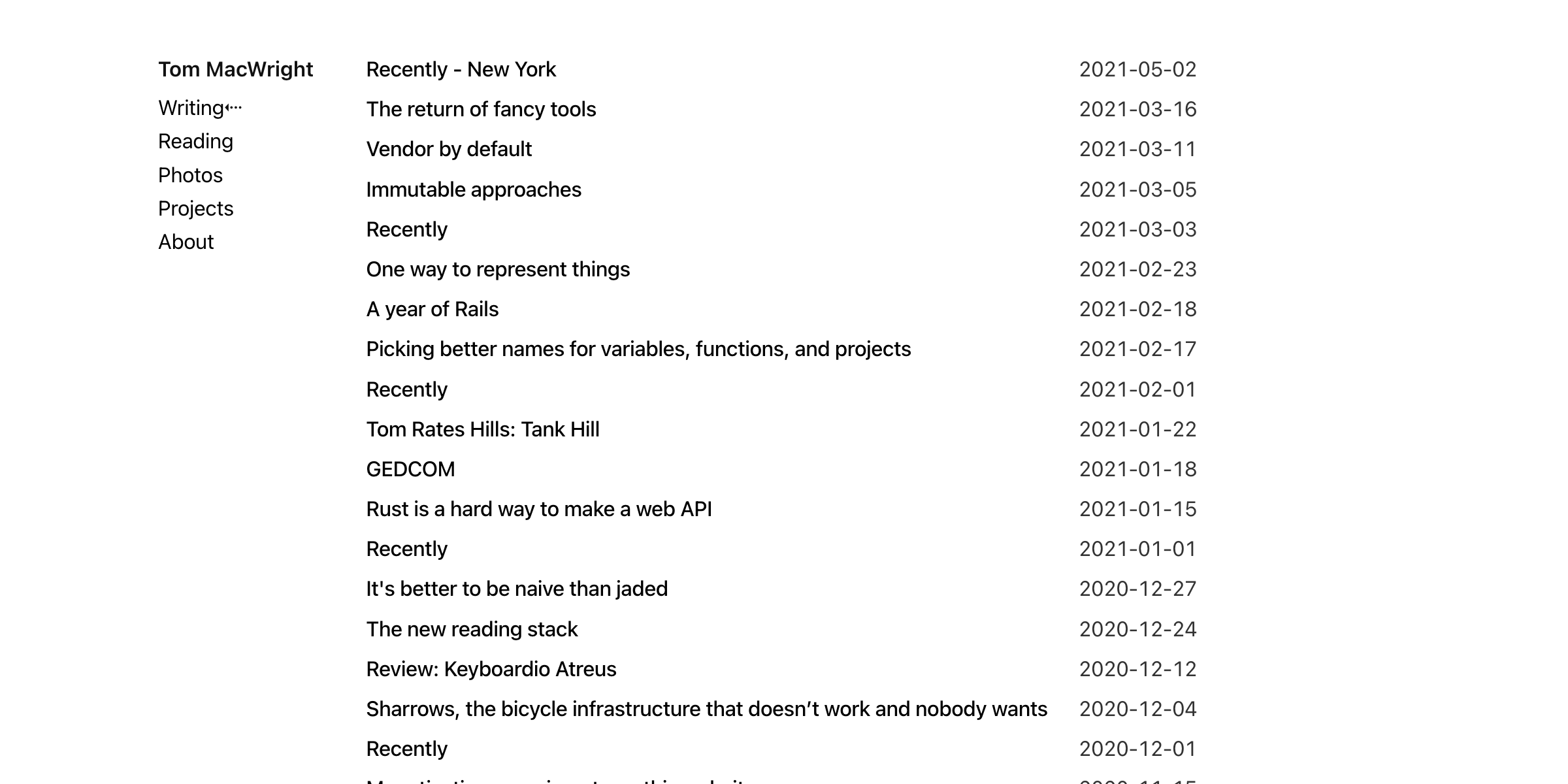
The choice of a two-column layout is, I believe, relatively uncommon for personal websites, but I liked the look, so I went about cloning this design on my website with Tailwind CSS.
Many things have changed in the years since then. I went through many, some might even argue too many, font choices and pairings (Switzer, Satoshi, Inter, IBM Plex Sans, and DINish, to name a few); I added more than a dozen themes and removed all of them except for light and dark after a while; I shifted parts of the website around to experiment with where everything fits together; and I adapted the design to the increasing amount of information on the website while adding more features (tags, read counts, additional pages, etc.)
Throughout these changes, the two-column layout mostly remained, and as my experience with design and web development in general increased, I became more comfortable with making changes that reflected what I personally thought was most aesthetically pleasing. Hours were spent on tweaking font weights, gaps, transition properties, and letter spacings, and with every change, a different style emerged.
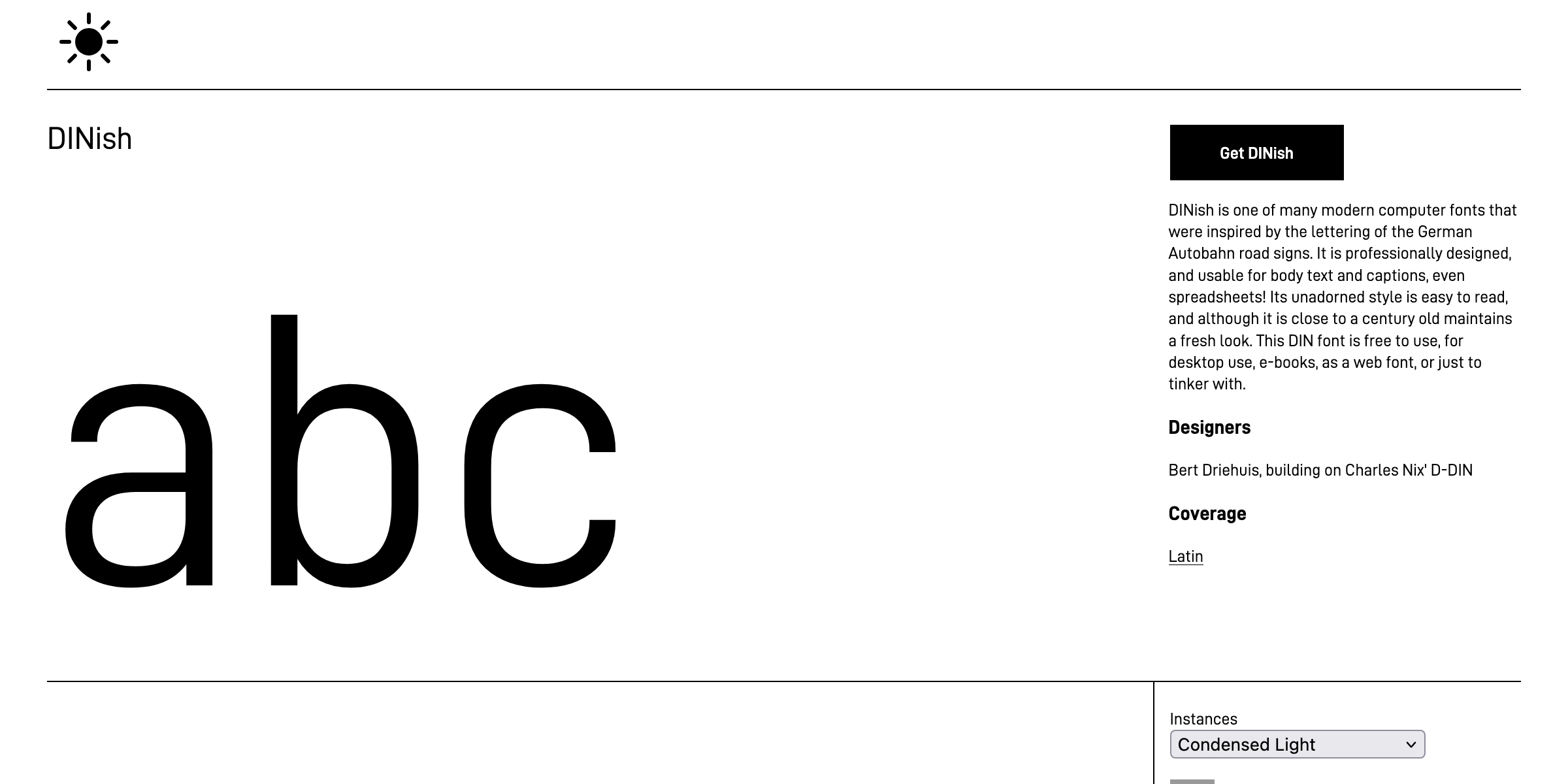
DINish was used for a while as the primary font; as a grotesque sans-serif typeface designed to be similar to FF DIN, it made the website feel modern, condensed, industrial, and fast-paced. Before that, I used IBM Plex Sans, another grotesque sans-serif font that is also quite well designed and introduces more character to the website’s design (compared to, say, system font stacks). Despite the various font family changes, the typographic design of this website had not changed much since 2021.
Which is why this recent redesign is such a milestone for this website and myself. Although I’m not a graphic designer myself by any measure, I’ve always been enamored with simple and elegant graphic design, whether it’s industrial design, typographic design, or human interface design, and I am happy to have been able to design something that, at least to my subjective point of view, embodies the functional and utilitarian aesthetic that I have hoped to attain, after many years of experience and practice.